Florunner: scaling global logistics
Strategic brand transformation for B2B expansion
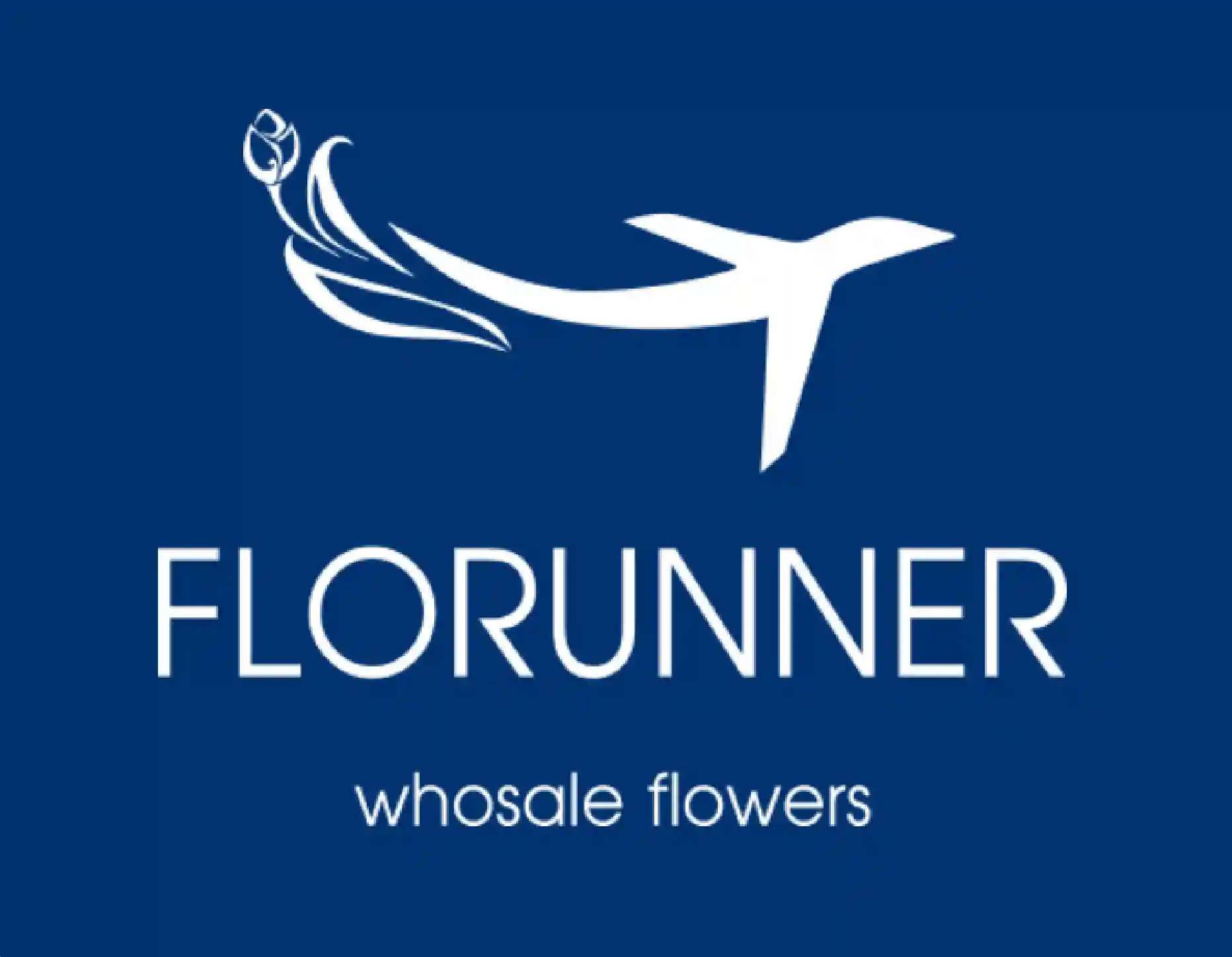
The challenge: Florunner’s original identity was outdated and contained critical technical errors (including typography and structural inconsistencies), undermining their status as a premium air-freight provider. They needed to transition from a "local supplier" look to a global tech-logistics powerhouse to enter the Eurasian market.Role
Lead Brand DesignerTask: brand identity redesign
My Senior Role As Lead Brand Designer, I didn’t just fix the visuals — I built a scalable design system. I audited the existing brand flaws, corrected structural errors, and developed a high-contrast visual language optimized for both digital tracking platforms and large-scale transportation.Duration
October 2025 — November 2025Key impact
- + Strategic alignment: positioned the brand for B2B expansion through a precision-driven grid system.
- + Operational scale: created a versatile framework for complex international air-shipping documentation and corporate assets.

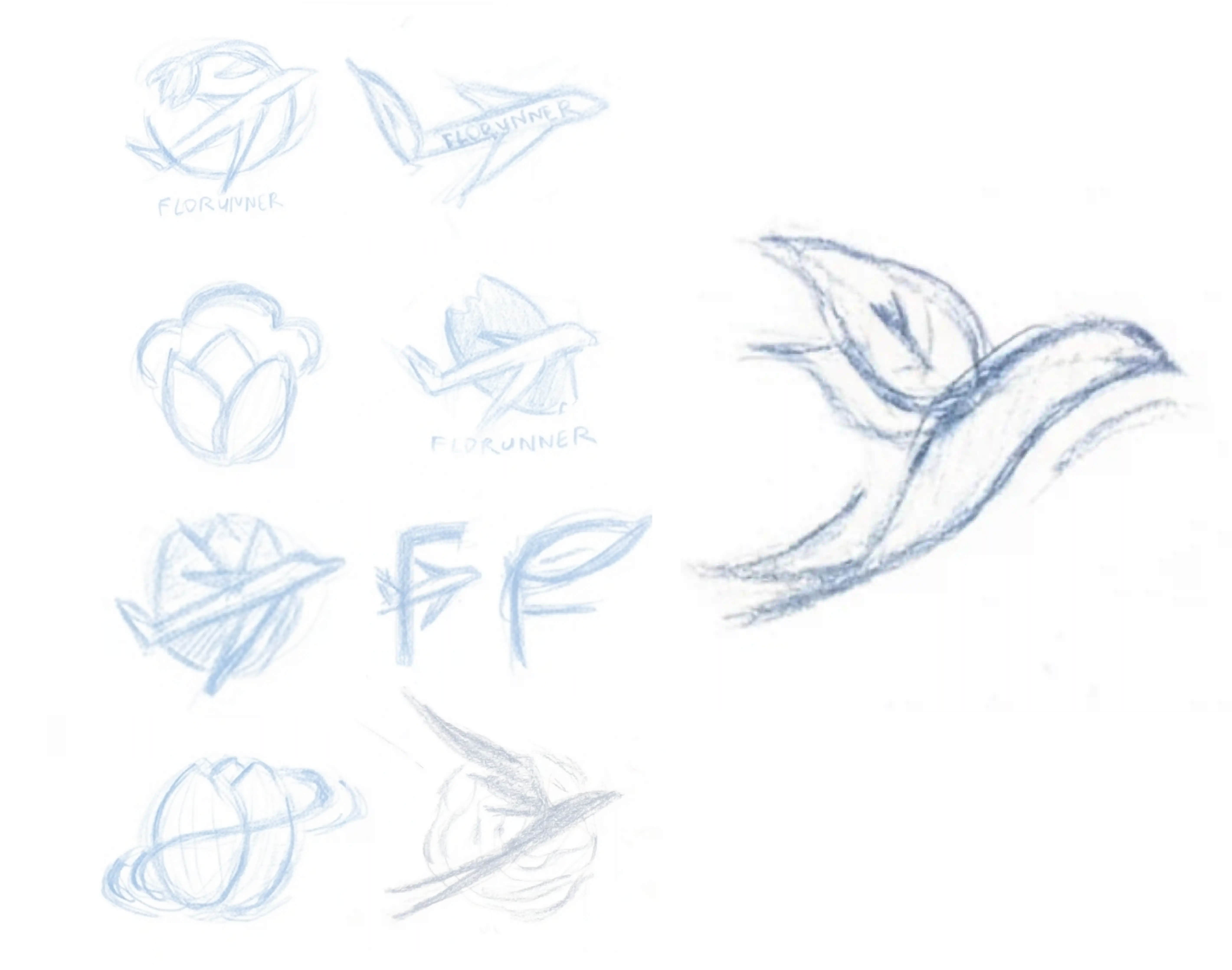
Research & Strategy
The goal was to bridge the gap between high-speed air logistics and the delicate nature of the
floral industry, moving beyond standard industry clichés like literal aircraft imagery.
The key steps:
The key steps:
| + | Market analysis: identified visual codes of reliability and global reach within the B2B air freight sector to ensure a premium positioning. |
| + | Concept evolution: shifted from direct metaphors to a sophisticated visual symbol that combines technical precision with organic freshness. |
| + | Future-proofing: developed a mark designed for high-performance integration into a broader design system, including complex patterns and digital assets. |
From ideation to result
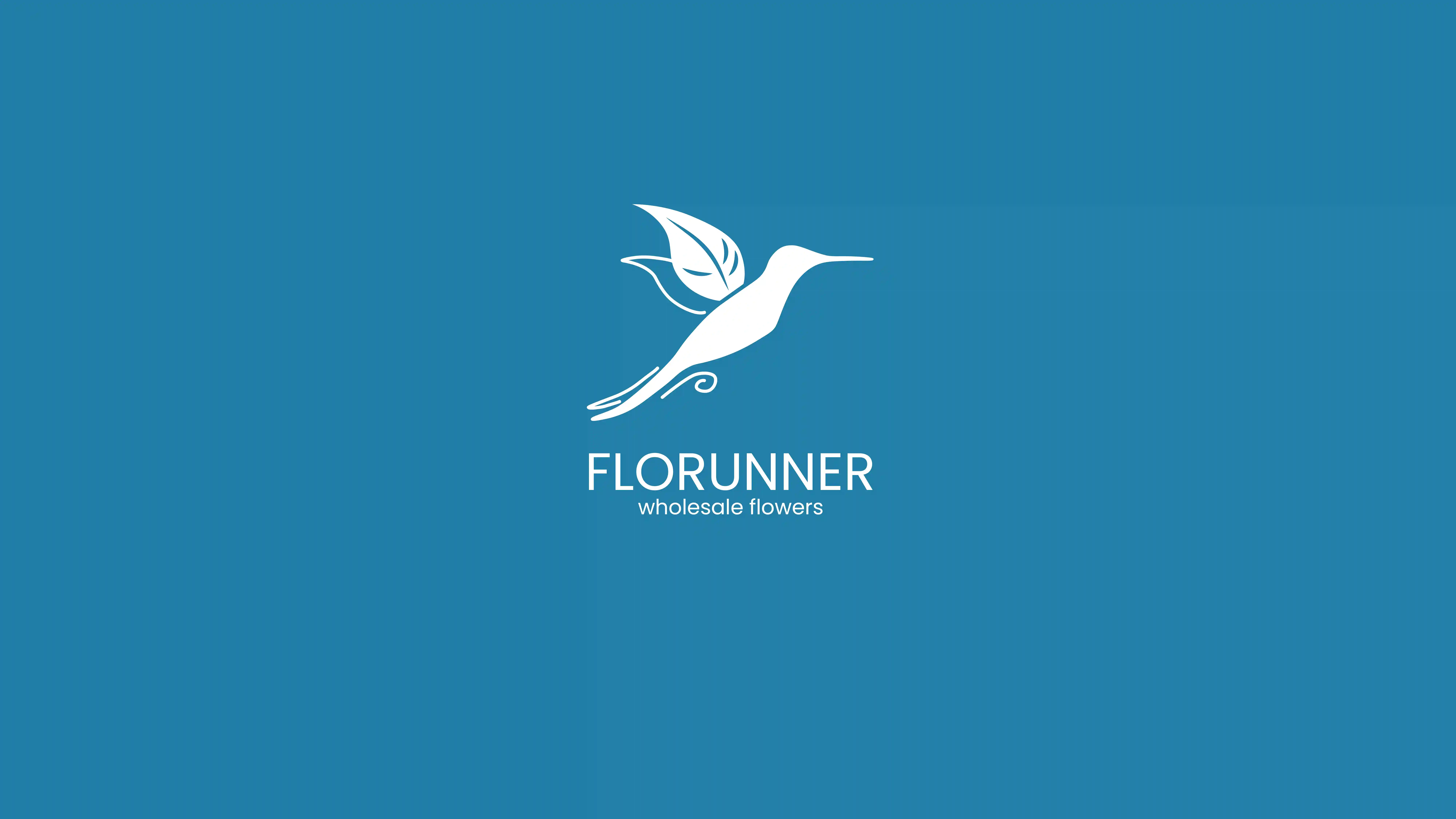
Before
After
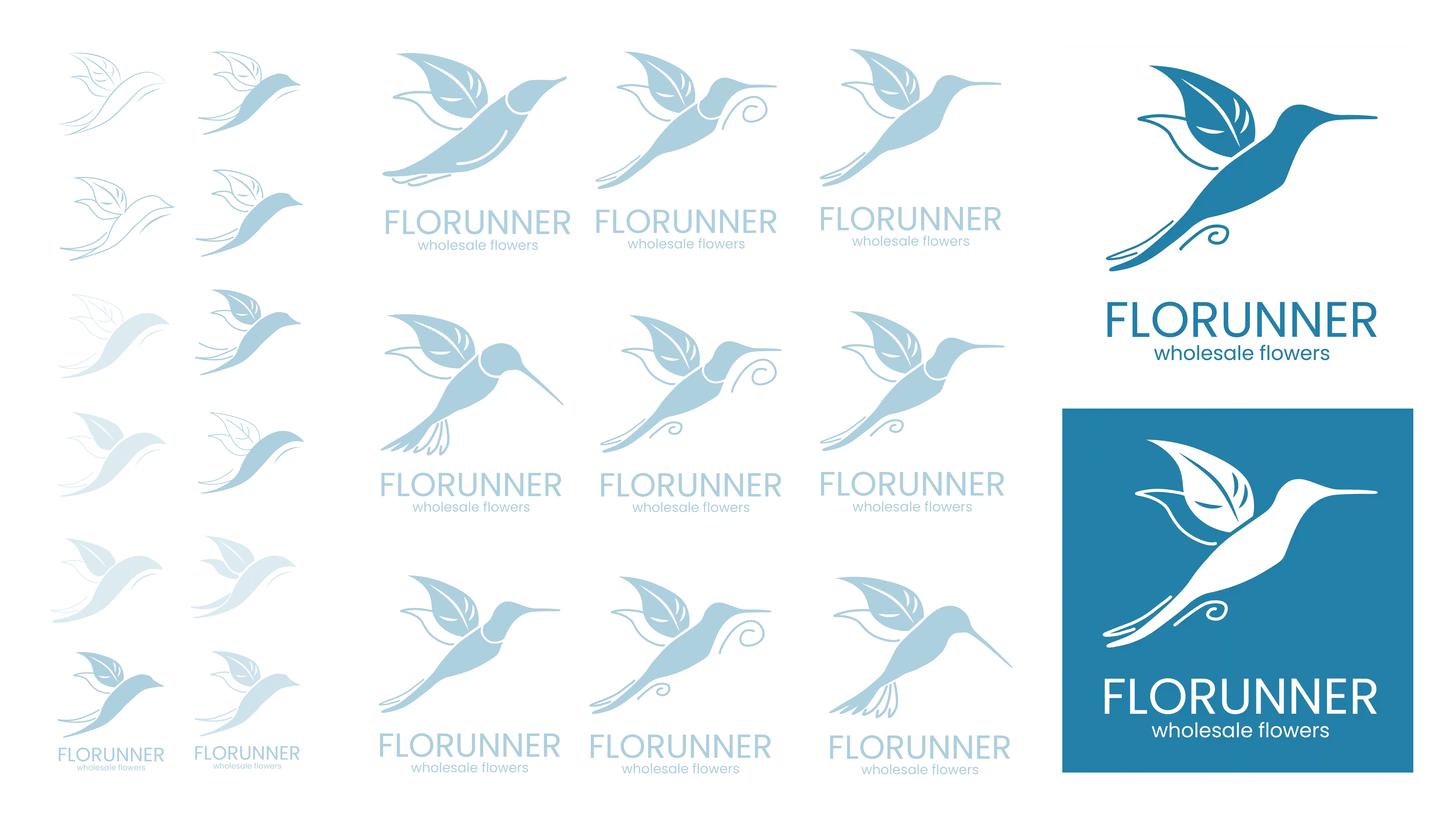
Visual balance & Optical correction
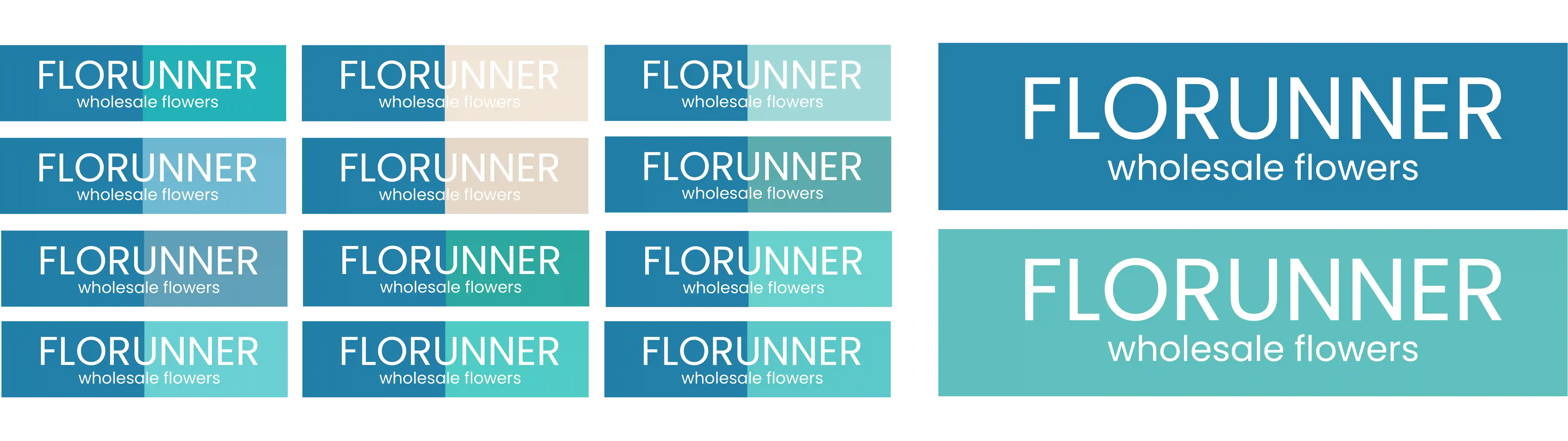
Color strategy & System
The Challenge
Before the redesign, the brand suffered from a complete lack of visual consistency: the logo
colors didn't match the stationery or digital assets, creating a fragmented and unprofessional
"visual noise." My task was to eliminate this chaos while respecting the client’s attachment to
their legacy palette.
Strategic Solution
| + | Market analysis: identified visual codes of reliability and global reach within the B2B air freight sector to ensure a premium positioning. |
| + | Concept evolution: shifted from direct metaphors to a sophisticated visual symbol that combines technical precision with organic freshness. |
| + | Future-proofing: developed a mark designed for high-performance integration into a broader design system, including complex patterns and digital assets. |
Typography & Legal risk management
During a technical audit, I discovered that the previous typeface was being used illegally without a
commercial license, creating a significant legal risk for the brand. Additionally, the original font had
severe legibility issues:
the "fl" character pair lacked proper kerning, causing the letters to merge into an unreadable "blob" — specifically in the company name Florunner.
I replaced the problematic font with Poppins — a modern, geometric sans-serif. I selected it for its close aesthetic resemblance to the client's preferred style, but with vastly superior technical performance.
| + | 100% legal & scalable: ransitioned to a high-quality open-source font, eliminating licensing costs and legal overhead for global expansion. |
| + | Optical clarity: solved the "fl" merging issue through Poppins' generous kerning and clean geometry, ensuring the brand name remains crisp at any scale. |
| + | B2B authority: the clean, balanced weights of the new typeface reinforce the brand’s positioning as a precision-driven logistics leader. |
Before
After
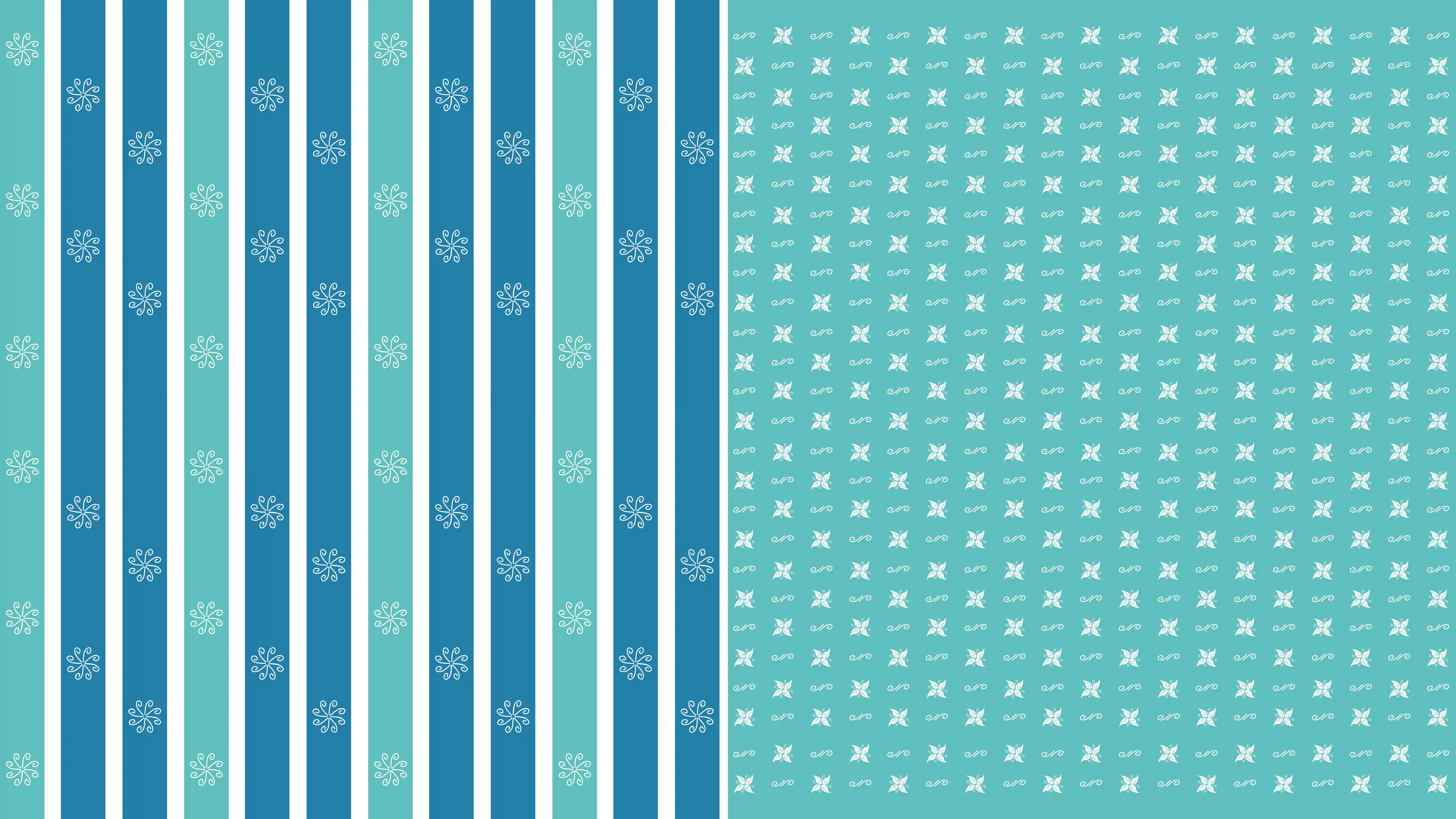
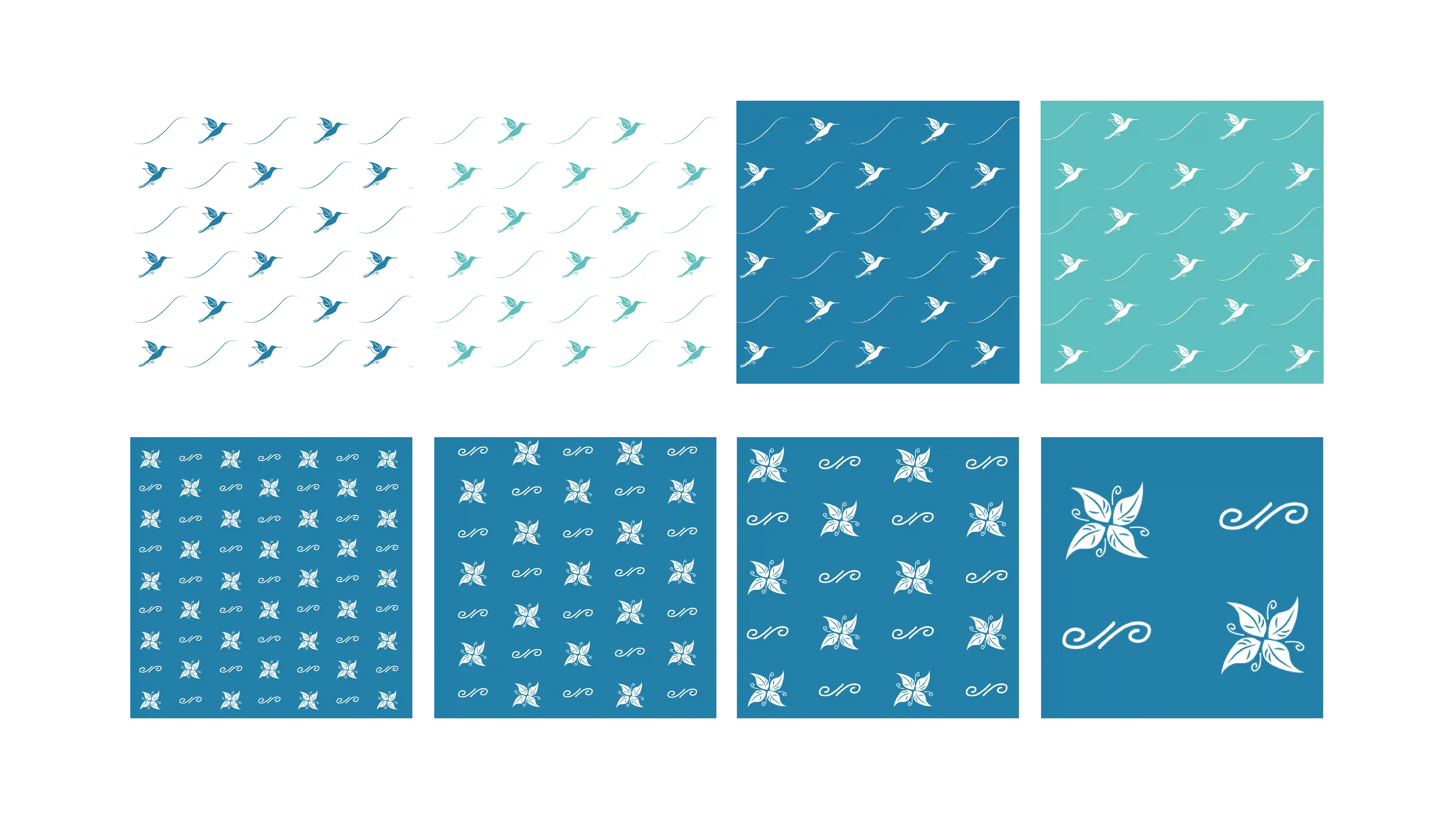
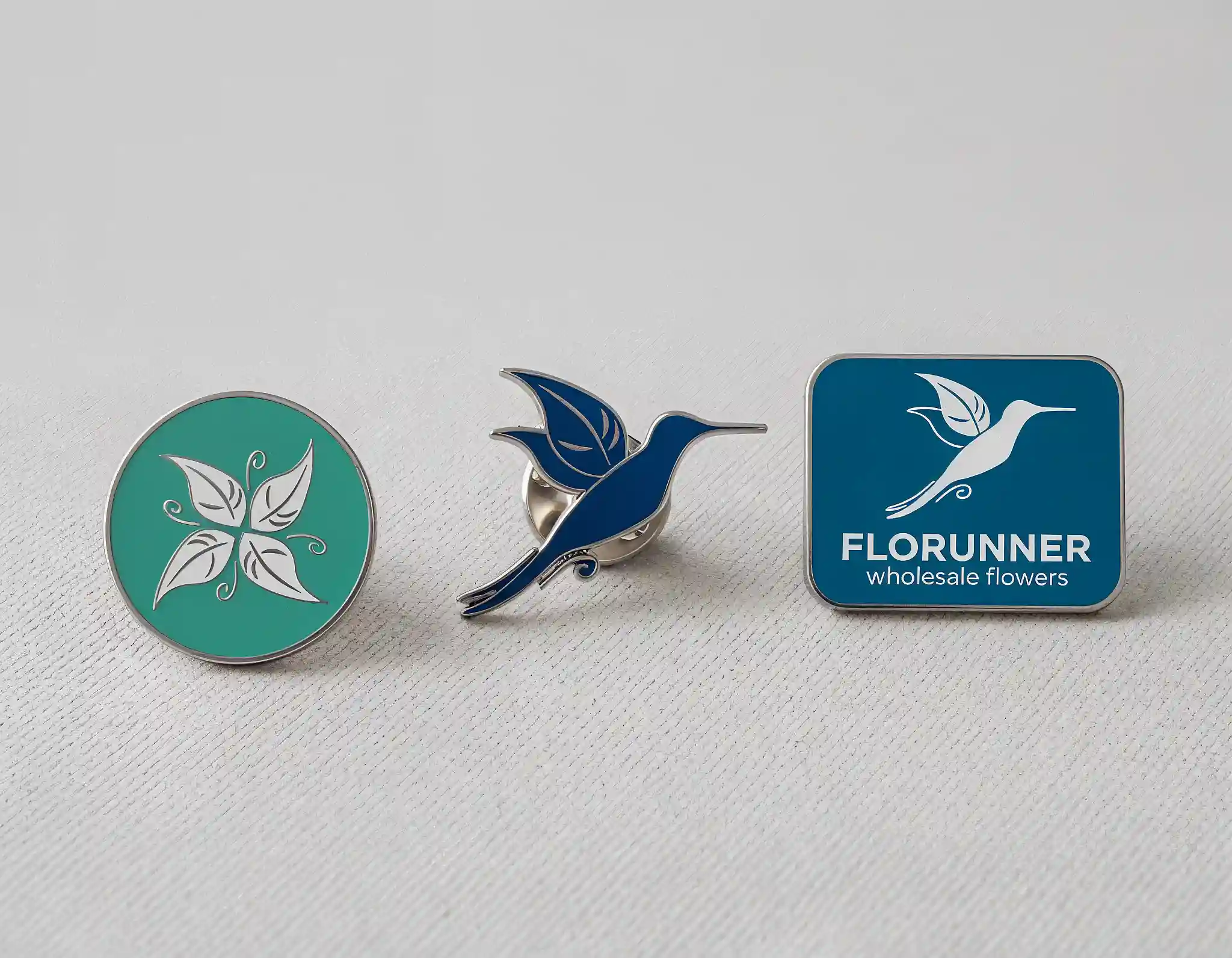
Scalable pattern system & visual identity
The brand previously lacked any unified visual language or brand assets, leading to inconsistent and
amateur-looking communication. The goal was to build a comprehensive pattern system from scratch that would
feel premium, recognizable, and versatile.
Instead of a repetitive, "literal" use of the logo, I developed a multi-layered pattern system. This ensures the brand remains cohesive across various scales and materials, from delicate packaging to large-scale shipping assets.
Instead of a repetitive, "literal" use of the logo, I developed a multi-layered pattern system. This ensures the brand remains cohesive across various scales and materials, from delicate packaging to large-scale shipping assets.
| + | Conceptual diversity: developed three distinct pattern directions—ranging from organic floral motifs to technical, "logistics-driven" geometric lines. |
| + | Functional adaptability: the system is designed to be modular. It can be "dialed up" for high-impact marketing materials or dialed down" for clean, professional B2B documentation. |
| + | Seamless integration: created a library of assets that allow the brand to scale globally without losing its unique visual "voice," providing the client with their first-ever professional brand toolkit. |

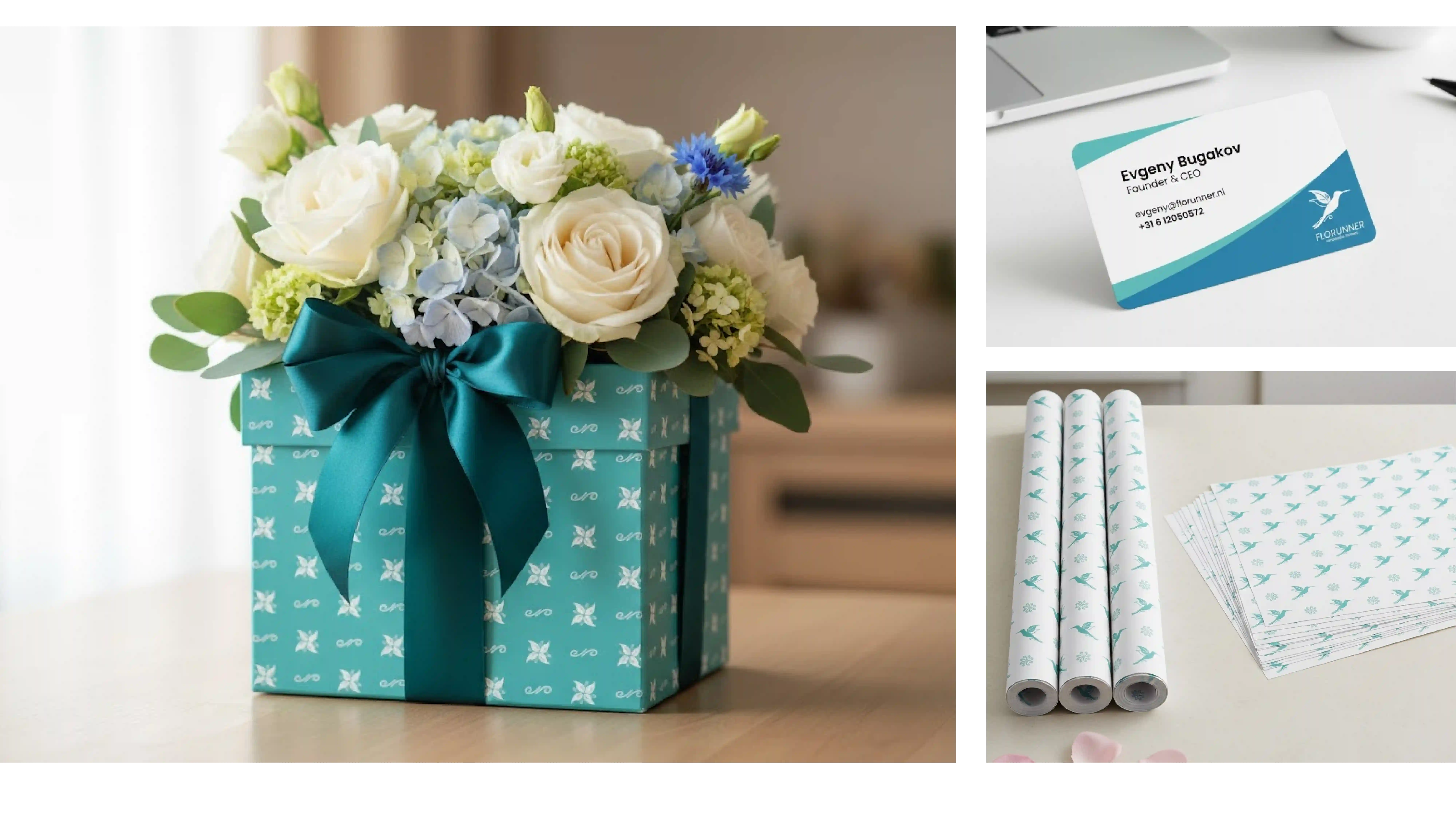
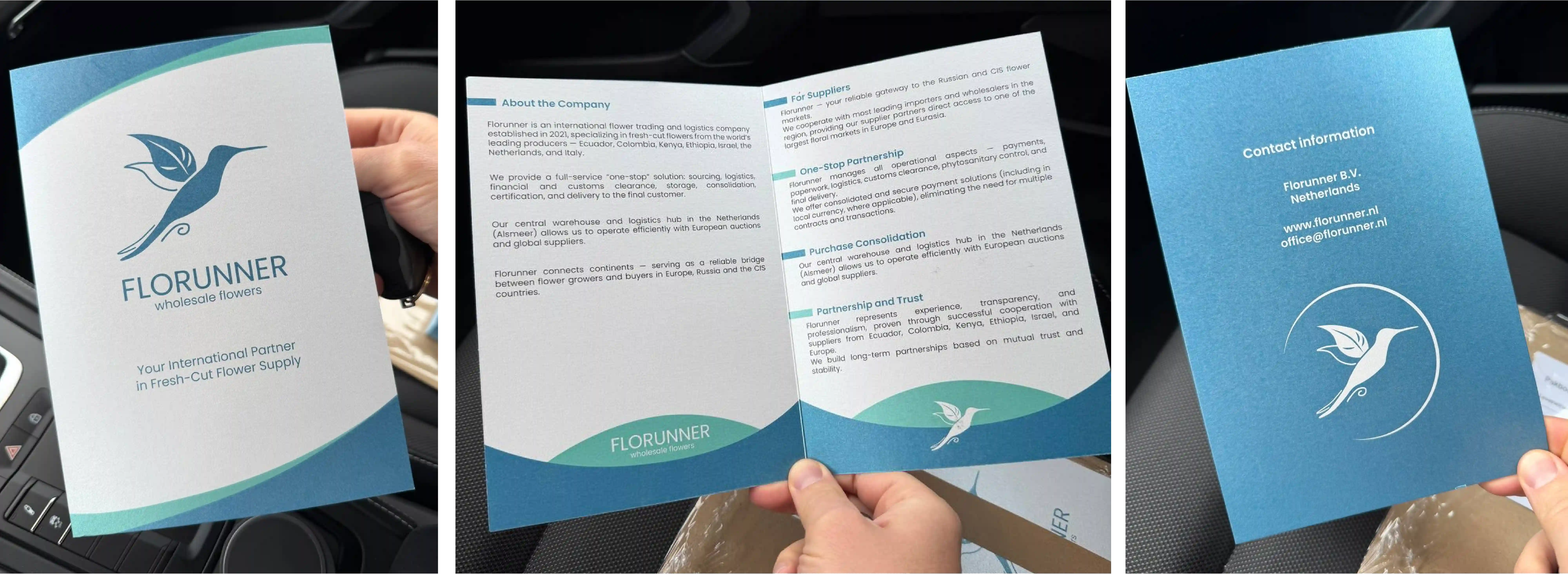
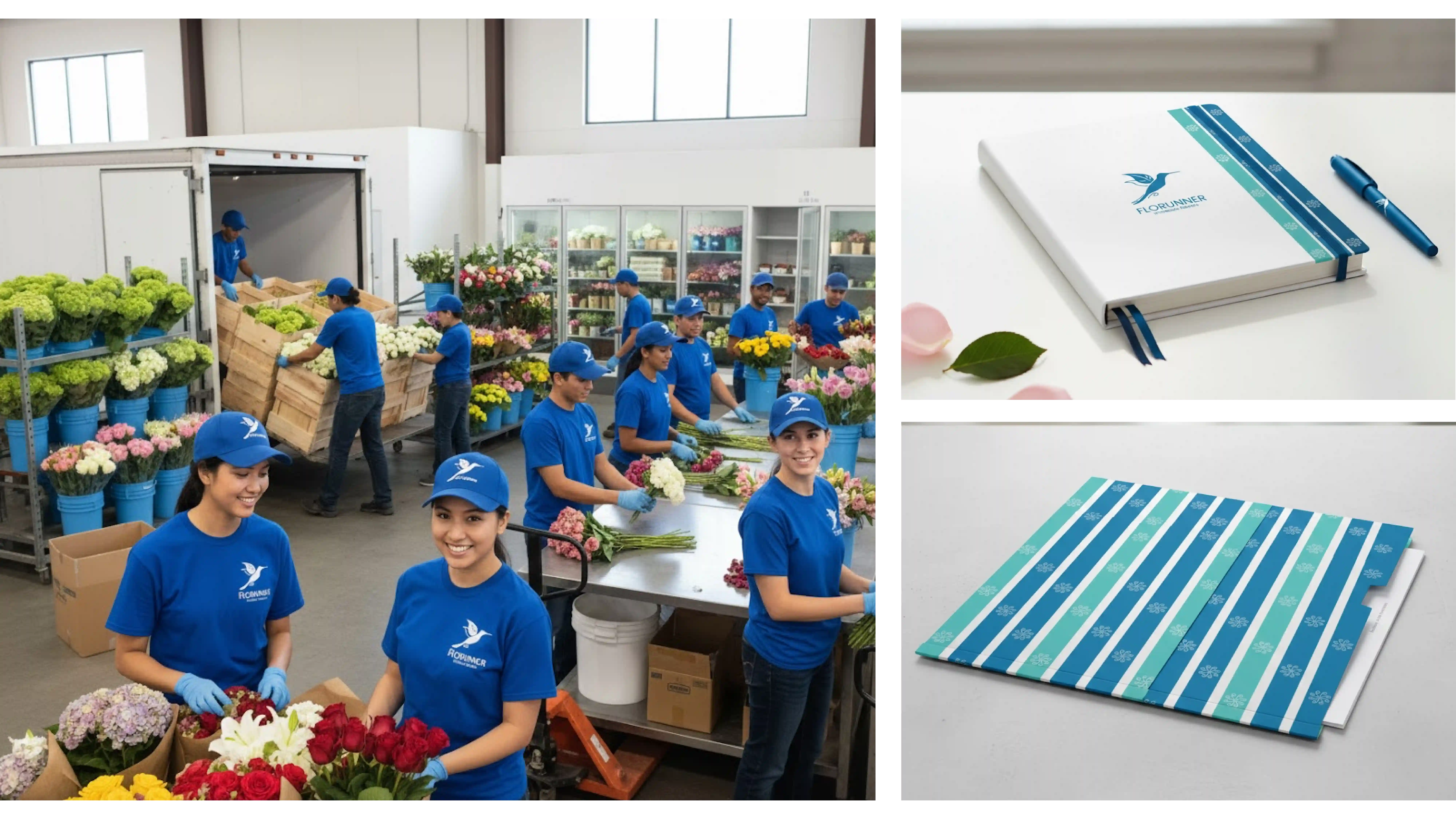
Brand ecosystem & Physical presence
To build a versatile toolkit that ensures professional consistency across all dimensions—from large-scale
transportation to premium business stationery.
Implementation Strategy:
Implementation Strategy:
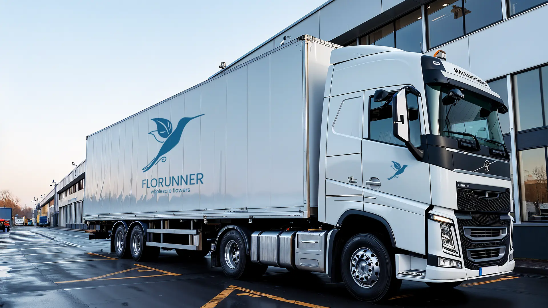
| + | Seamless scaling: engineered to maintain geometric integrity from 15-meter trailers to high-detail print. |
| + | Information design: focused on clean, structured layouts to simplify complex B2B service data. |
| + | Tactile unity: unified every touchpoint to reinforce professional authority and long-term partner trust. |
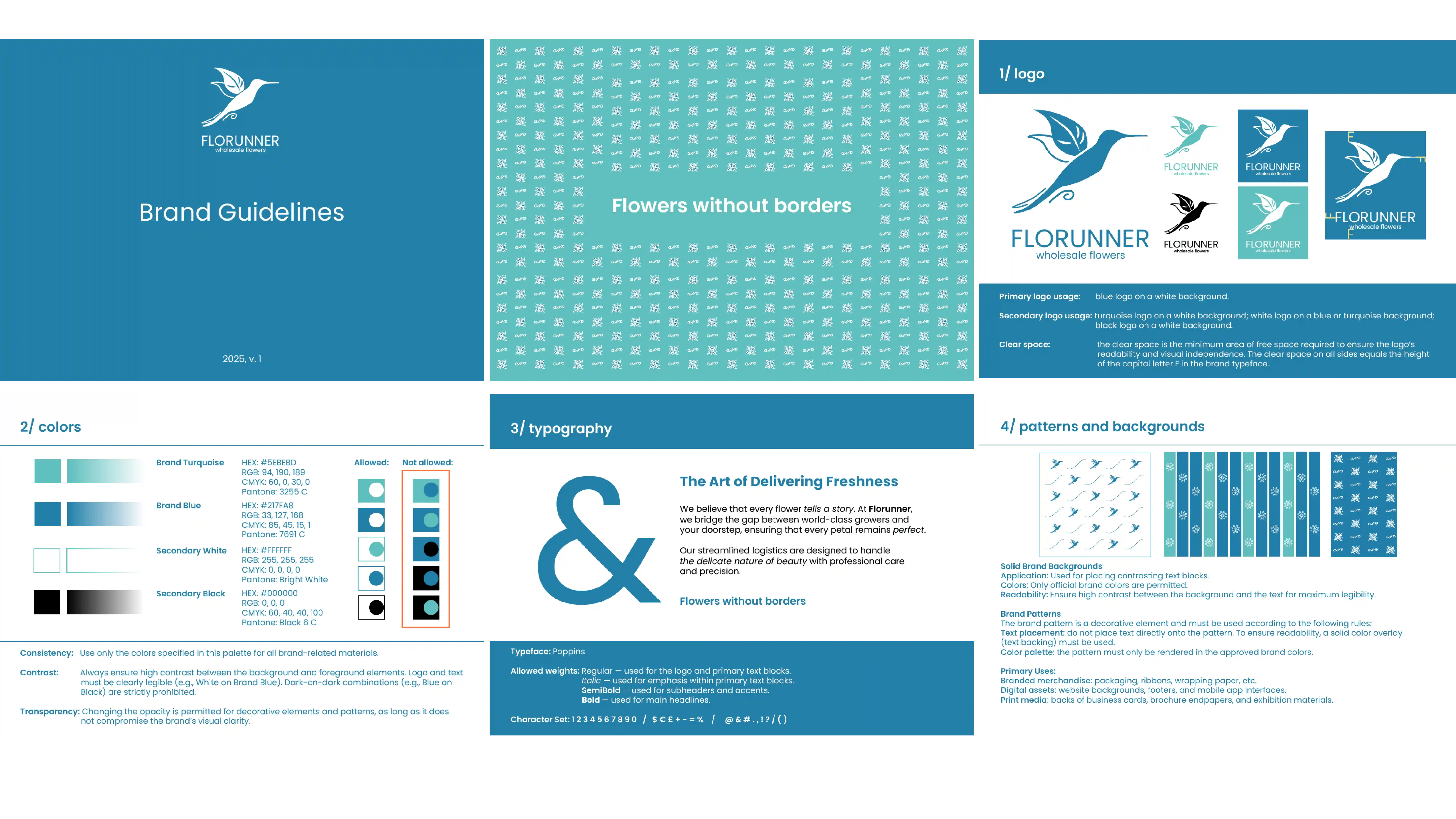
Brand guidelines & Standardization
To ensure long-term brand consistency, I developed a comprehensive set of Brand Guidelines. This document
serves as a "source of truth" for the client, internal teams, and third-party vendors, providing clear rules
for every visual element.
Key Components:
Visual standards: precise rules for logo, clear space, and usage.
Technical assets: color palettes (CMYK/RGB/Pantone) and typography.
System logic: guidelines for pattern application across all touchpoints.
Key Components:
Visual standards: precise rules for logo, clear space, and usage.
Technical assets: color palettes (CMYK/RGB/Pantone) and typography.
System logic: guidelines for pattern application across all touchpoints.